
With the increasing reliance on mobile devices for local searches, ensuring your website is mobile-friendly is crucial for optimizing your local SEO efforts. You can improve your site’s usability and search visibility by implementing responsive design, optimizing load times, and enhancing content accessibility on smaller screens. These adjustments not only benefit your ranking but also enhance the user experience, ultimately driving more traffic to your local business.
Key Takeaways:
- Ensure responsive design for optimal viewing on various mobile devices.
- Optimize loading speed by minimizing image sizes and leveraging browser caching.
- Utilize local keywords and create location-specific content to enhance visibility in local searches.
The Crucial Role of Mobile-Friendliness in Local SEO
A mobile-friendly site significantly influences your local SEO success. With over 60% of online searches conducted on mobile devices, Google prioritizes sites that provide optimal mobile experiences. If your site isn’t mobile-friendly, you risk losing visibility in search engine results, particularly for local queries where convenience matters most to users.
Impact on Search Rankings
User Experience and Engagement Metrics
Key Elements of a Mobile-Optimized Website
Your mobile-optimized website offers a seamless experience that aligns with users’ expectations on smaller screens. Key components include responsive design, intuitive navigation, quick loading times, and mobile-friendly content. These elements not only enhance user satisfaction but also positively impact your local search rankings. Prioritizing these factors ensures visitors can easily access your information regardless of their device.
Responsive Design vs. Adaptive Design
Responsive design adjusts your website’s layout fluidly based on the screen size, providing a consistent user experience across devices. In contrast, adaptive design uses fixed layouts tailored for specific screen sizes, which may lead to inconsistent experiences if users switch devices. Opting for responsive design typically offers better flexibility and improved performance in terms of local SEO.
Importance of Fast Loading Times
Fast loading times are imperative for retaining visitors and improving search engine rankings. Pages that load in under three seconds significantly enhance user experience and reduce bounce rates, especially on mobile devices where patience is often lower. Engaging content is ineffective if users abandon your site due to slow speeds.
Studies reveal that a 1-second delay in loading time can result in a 7% reduction in conversions. Users expect instant gratification, particularly on mobile, and lengthy load times can frustrate them, leading to site abandonment. Utilizing techniques such as image optimization, minifying code, and leveraging browser caching can dramatically enhance loading speeds, creating a better experience and ultimately improving your local SEO efforts. Tools like Google PageSpeed Insights can help identify areas for improvement and track performance regularly.
Crafting Localized Content for Mobile Users
Localized content enhances user engagement and builds a connection with your audience. Focus on crafting content that speaks directly to local interests, events, and culture, ensuring your messaging resonates with the community you serve. Utilize local insights, anecdotes, and community-specific information to create a sense of belonging. This approach not only improves your site’s relevance but also boosts local SEO, ensuring your audience finds valuable information tailored to their needs.
Leveraging Local Keywords
Incorporate local keywords throughout your content to enhance visibility in local search results. Use specific phrases that reflect local language and common search queries to connect more effectively with customers in your area. Research popular terms through keyword tools or by analyzing competitor content, and seamlessly integrate these phrases into your web pages, blog posts, and metadata to signal relevance to search engines.
Creating Location-Specific Landing Pages
Location-specific landing pages cater to different geographic areas, allowing for targeted messaging and offers. Each page should highlight unique aspects of your service or product relevant to the local audience. Include local landmarks, cultural references, and tailored calls to action that encourage visitors to engage with your business. The goal is to create a personalized experience that meets the specific needs of users in various locations, improving your chances of conversion.
Creating effective location-specific landing pages involves understanding your audience and their unique preferences. For example, if you operate in multiple cities, develop tailored content for each locality, addressing specific community needs, local events, or seasonal offers. Adding testimonials from local customers and incorporating local SEO tactics, such as geo-specific keywords and Google Maps integration, can significantly enhance your page’s visibility and relevance. Utilizing analytics to refine content based on user engagement can also drive better results in terms of traffic and conversions.
Essential Technical Aspects for Mobile Usability
Optimizing your site for mobile usability involves more than just responsive design. Focus on loading speed, as studies show that 53% of mobile users abandon sites that take over three seconds to load. Prioritize simplicity in navigation through streamlined menus and avoid pop-ups that disrupt user experience. Ensure text is readable without zooming, and use appropriately sized buttons for easy tapping. Each of these aspects contributes to a smooth mobile experience, enhancing user satisfaction and engagement.
Utilizing Mobile-Friendly Testing Tools
Mobile-friendly testing tools evaluate your website’s performance on mobile devices. Google’s Mobile-Friendly Test is an excellent resource, providing feedback on usability issues like touch elements being too close together or text being too small. Running your site through these tools highlights specific areas for improvement, enabling you to create a better mobile experience for your users.
Implementing Schema Markup for Local Listings
Schema markup enhances your website’s visibility in local search results by providing search engines with structured data about your business. This data improves the chances of appearing in rich snippets, helping potential customers find important details like your address, phone number, and hours of operation. Properly implemented schema leads to higher click-through rates and better local SEO performance.
Including JSON-LD schema markup for your local business is an effective tactic to boost local visibility. Ensure you specify vital information such as your business name, location, and the services you offer within the code. Tools like Google’s Structured Data Markup Helper can simplify this process, guiding you in adding the most relevant schema types—like LocalBusiness or Place—to your website. These enhancements not only aid search engines in understanding your content but can also enrich how your listings appear in search results, making them more appealing to users.
Best Practices for Ongoing Mobile SEO Maintenance
Continuous optimization is necessary for maintaining your site’s mobile-friendly status. Regular updates to your site’s content, structure, and performance can help secure your rankings in local searches. Monitoring your analytics and user behavior will provide insights that inform adjustments, ensuring a seamless mobile experience that aligns with evolving search algorithms and user expectations.
Regular Mobile Performance Audits
Conducting mobile performance audits on a regular basis will identify areas for improvement. Use tools like Google PageSpeed Insights, GTmetrix, or Lighthouse to assess factors such as loading speed, mobile-friendly design, and overall user experience. These insights allow you to make data-driven decisions to enhance your site’s functionality and responsiveness on mobile devices.
Staying Current with Mobile SEO Trends
Keeping up with mobile SEO trends ensures your strategies remain effective. Changes to algorithms, user behavior, and technology are constantly evolving, impacting how sites rank in search results. Regularly follow reliable SEO blogs, attend webinars, or participate in online forums where industry experts share the latest developments and best practices for mobile optimization.
For instance, tools like Google Search Console offer real-time insights about how Google views your mobile site, providing alerts on any changes in performance. Engaging with platforms like Moz or Search Engine Journal enables you to access curated content on emerging trends such as voice search optimization and mobile-first indexing, allowing your strategies to stay relevant in an ever-changing landscape.
To wrap up
Conclusively, to ensure your site is mobile-friendly for local SEO, focus on responsive design, fast loading speeds, and easy navigation. Optimize your content for mobile users by using shorter paragraphs and larger buttons. Utilize local keywords and structured data to enhance visibility in local searches. Lastly, test your site on various mobile devices and make necessary adjustments to maintain a positive user experience, ultimately improving your local search rankings.
FAQ
Q: How can I optimize my website for mobile devices?
A: To optimize your website for mobile devices, ensure your design is responsive, meaning it adapts to different screen sizes. Use flexible images and CSS media queries to maintain usability across devices. Keep loading times fast by compressing images and minimizing code.
Q: What role do local keywords play in mobile SEO?
A: Local keywords are important for mobile SEO as they help improve visibility in localized search results. Identify keywords that reflect local intent, such as city names or phrases like “near me.” Incorporate these keywords naturally into your site’s content, meta tags, and descriptions.
Q: How can I improve user experience on mobile for local visitors?
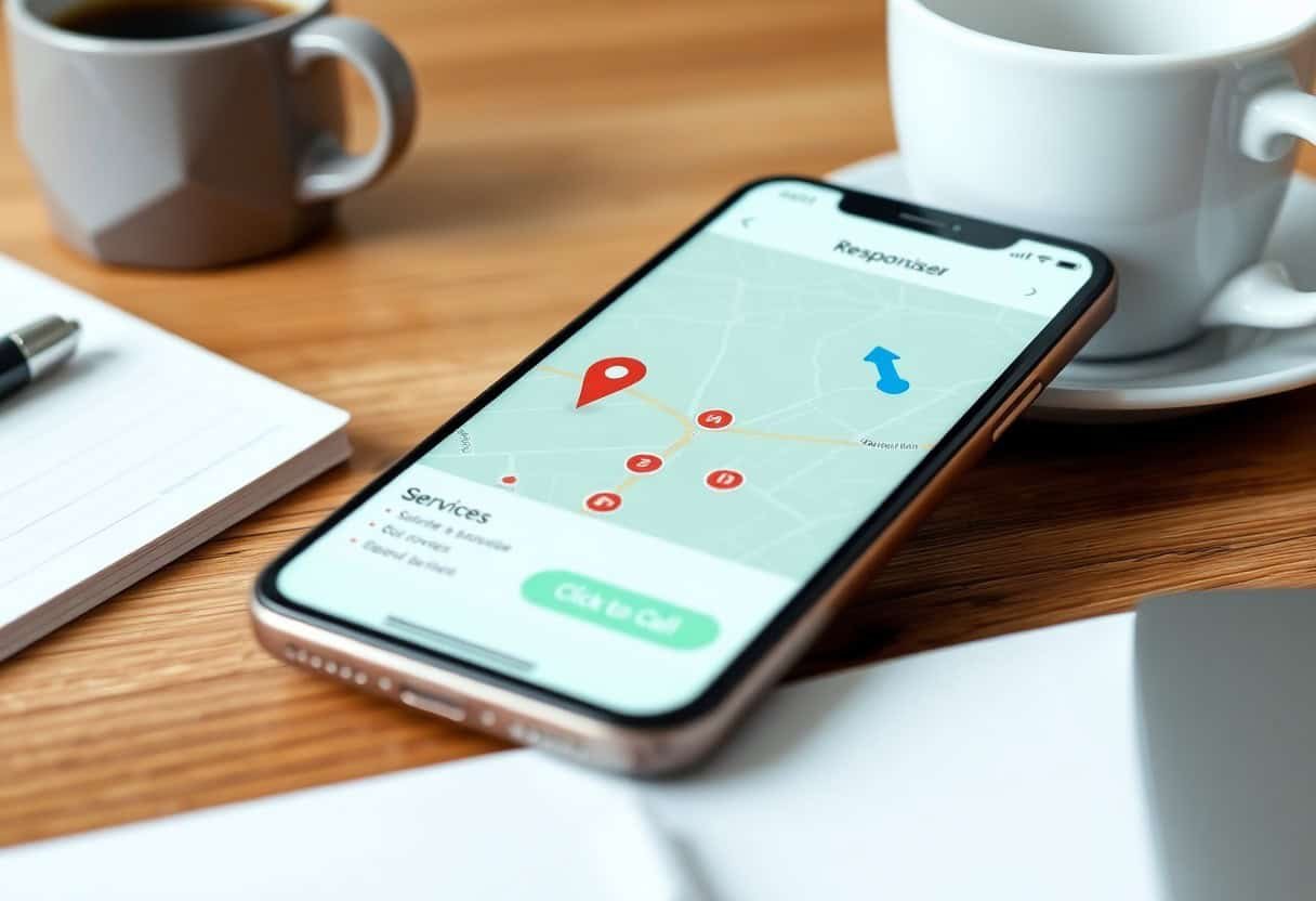
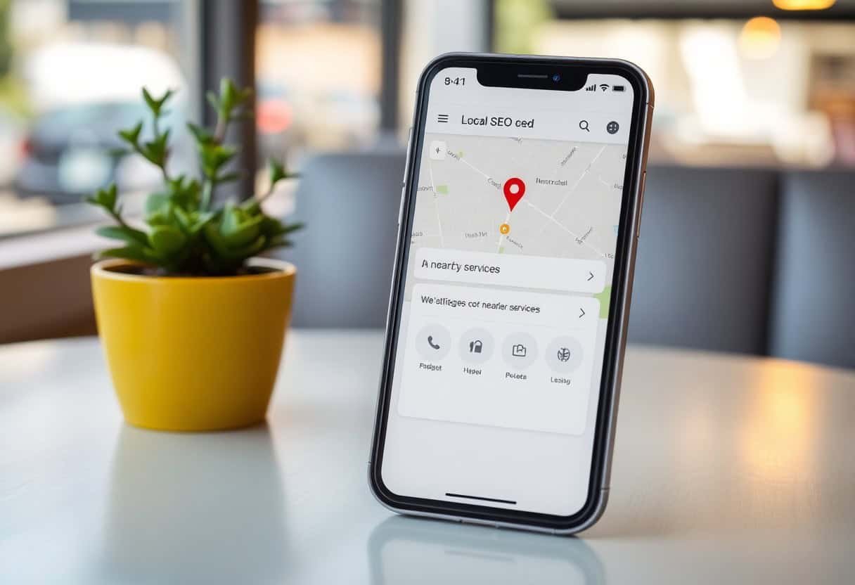
A: To enhance user experience for mobile visitors, simplify navigation by using a clear menu structure. Ensure buttons and links are easily clickable and have sufficient spacing. Include local contact information and a map on your site to assist visitors in finding your location easily.